
Sunday 18 December 2011

Saturday 17 December 2011


Friday 16 December 2011

Tuesday 6 December 2011
Monday 5 December 2011


Sunday 4 December 2011


Saturday 3 December 2011


Thursday 17 November 2011


Wednesday 16 November 2011


Monday 24 October 2011

Sunday 23 October 2011


Saturday 22 October 2011
Project 05 - Pay To Play
 The idea behind this pound coin idea was a combination of things one of those things was the united nation logo and a radar. The x in the middle of the coin on the United States map symbolises where the source of the current global economic state started. The date on top represents the date birth of the economic financial state. The little maps highlighted in red are the locations that got hit the hardest with today's problem. The circles represents the spread of the global problem into different countries.
 Thursday 20 October 2011

Wednesday 19 October 2011
Project 03 - Brand Me Up Buttercup!
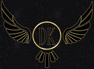
 This logo was made for Oliver Kelly, the black colour in the middle represent his personality because from first impression you would think he was rude and disrespectful. But after knowing talking to him you can see his quite a down to earth and cool guy hence why i also include the colour white in my design. The Base of the logo is shaped like a guitar because when I first met him he had a ukulele on him and also in his spare time he enjoys writing music. The reason for the rugby ball shape on the left is because his part of the university rugby team and really enjoys watching and playing rugby in his spare time. The point at the bottom represent Oliver love for drawing and doing little sketch's in his art book and note pad.
Tuesday 18 October 2011

Saturday 1 January 2011

Subscribe to:
Posts (Atom)